


Java 2 SE 6.0 Aesthetics Preview
Introduction
Background
While surfing on the web the other day I decided to check out the development progress of the next Java version. Codenamed Mustang and gifted with the number 6.0, it promises some exciting new graphical features for Java applications. I downloaded a binary snapshot and tested two new aesthetic changes: subpixel font rendering and the new and improved GTK Look and Feel.
Which horse, and which course
Before we start, let me again state that I tested a binary development snapshot because Mustang is still in active development. The build number I tested was b54, compiled and released on the 29th of september 2005. I tested the self-extracting 32-bit and 64-bit Linux versions, not the RPM ones. I tested the JDK on Ubuntu 5.04, Hoary Hedgehog, also both the 32-bit and 64-bit version.
My fonts in GNOME were set to Bitstream Vera Sans, although I'm not really sure that font is used in the font rendering test. Base font size was 10 points.
Subpixel Antialiased Font Rendering
Short history
Let's dive into the first feature, subpixel antialiased font rendering, because it will increase readability on modern TFT and LCD screen by a large amount. Rendering of fonts on a subpixel grid was already supported by the major operating systems, like Windows and Mac OS X, and desktop environments like KDE and GNOME, but Java uses its own cross-platform software widget rendering system called Swing.
Java offered simple grayscale antialiasing in earlier releases, which could be activated by a runtime parameter, or set on run time using a system property. Using GNOME, antialiasing would automatically be enabled if setup in the font configuration panel. Mustang's subpixel antialiasing will activate when the windowing system supports it. This feature works for Windows, Mac OS X and GNOME already, but you can't get subpixel rendered text on other OSes and DEs yet, which is a pity for KDE users like me. Luckily, it's entirely possible a command line switch or system property will be introduced later on to manually enable this behaviour.
Test conditions
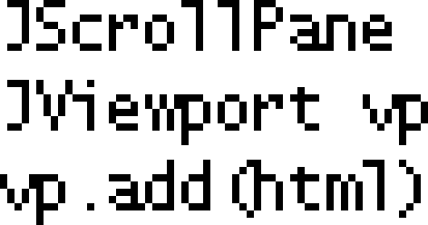
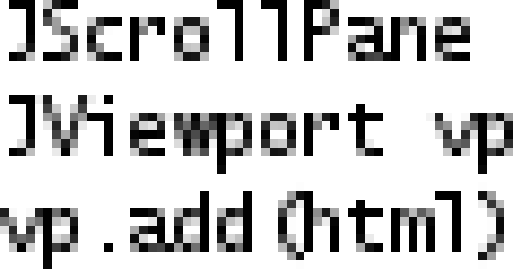
First of all, I compared font rendering on Java 1.5.0 and 1.6.0 to see if there were any differences. There were none, but you can always check the screenshots I placed here to see if you can spot any differences in the non-antialiased and plain antialiased texts. So, the images below are all taken from the Java 1.6.0 runtime. The sample text I used for comparing rendering techniques comes from the SwingSet demo, supplied alongside the Mustang JDK.
Normal sized font rendering
The following three examples are taken from the SwingSet editor demo title page. It is a boldfaced normal sized text.


MADE BY rendered without antialiasing.


MADE BY rendered with plain, grayscale antialiasing.
![]()
![]()
MADE BY rendered with subpixel antialiasing.
If you've got a TFT or LCD monitor, pay special attention to the small versions just above the 8 times enlarged images, if you've got a monitor with RGB-ordered subpixels, the lowest example will look just like Cleartype or FreeType2 subpixel rendered fonts. Very sharp and crisp.
Small font size rendering
To really get an idea of the differences between no, normal and subpixel antialiasing I decided to create the same example screenshots for small sized fonts. I took the following screenshots from the source tab which includes very small letters.

Source code rendered without antialiasing.

Source code rendered with plain, grayscale antialiasing.
![]()
![]()
Source code rendered with subpixel antialiasing.
The most notable difference is again in the lowest screenshot, look at the lowercase 'w' and compare it with the plain antialiased version - the subpixel one contains slightly more details making the text more intelligible. Again, if you want to see the full comparison screenshots, look on this page.
GTK Look and Feel
Short history
Again a very short overview of the history of this feature. The GTK Look and Feel was introduced in Java 1.4.2 and subsequently released in Java 1.5.0. It already looked promising in the 1.5.0 release, but it only supported a few GTK engines, which limited the amount of themes that could correctly be displayed. An engine forms the basis for a theme, so you can have multiple look alike themes that share the same engine. An example of an unsupported theme engine in 1.5.0 is clearlooks, which renders as a boxy default theme. Mustang on the contrary, does deliver a well done version of clearlooks as we'll soon see.
The new Mustang GTKLookAndFeel class implements rendering using native calls to GTK engines, thus making it possible to reuse any installed GTK for the Swing look and feel. This is a major step forward, because you can now use all your favourite GTK themes for rendering Swing applications, which makes the Java applications visually integrate nicely into your desktop environment.
About the test
For testing and finding differences between the 1.5.0 and 1.6.0 versions of the GTKLookAndFeel, I decided again to use the SwingSet demonstration. I picked four different tabs and four different themes I wanted to test on each Java version. The chosen themes are Clearlooks DeepSky, Default, Grand Canyon and Smokey Blue. The SwingSet tabs I chose where:
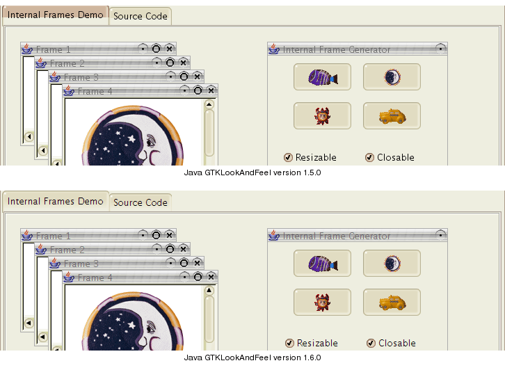
- Internal Frames, because of the visual style of the frames.
- Buttons, to test the rendering of normal and customized widgets.
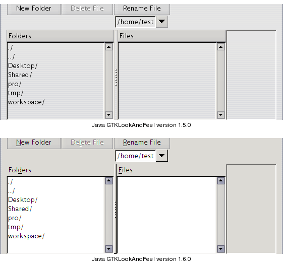
- Custom FileChooser, to see how the GTK file chooser integrates into the Java application.
- Table, because of the wide variety of widgets used on this tab.
You can take a look at the full size screenshots of the tabs and themes at the 1.5.0 GTK screenshots page and the 1.6.0 GTK screenshots page. Note that in both scenarios I enabled subpixel antialiasing, but unsurprisingly Java 1.5.0 falls back to grayscale rendering. After taking the screenshots, I cropped and composed them and placed them on this screenshot page.
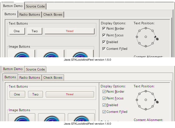
GTK Look and Feel comparison: Default theme
There are numerous differences in the way Java 1.5.0 and 1.6.0 render the native GTK theme onto Swing widgets, and I'll try to address all of them. Starting out with the first example, the interal frames demo on the Default GTK theme.
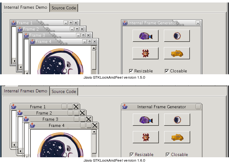
There are three major differences in this comparison: first of all, the window decorations of the internal frames are not the same. Java 1.5.0 seems to render them correctly, using the native window decorations. Mustang displays some sort of clearlooks variety with rendering errors on the window buttons. Unfortunate to say, I like the older rendering better, because it fits better into the theme and hasn't got rendering errors.
Second difference is the way tabs are rendered, look at the topside of each screenshot: the older Java renders them correctly, the active tab is easily discernable and simply looks good. On Mustang however, the active tab is rendered just like background tabs, just slightly larger. This seems to be incorrect and makes the tabs hard to distinguish. Mustang does add a mouse rollover effect, which is rendered using the active-tab themeing, so it seems there's a just a slight problem in the Mustang rendering which can be easily corrected.
The third difference, which will hold for all screenshot comparisons, is the fact that subpixel rendering is enabled on the Mustang version. Maybe just a slight difference, but it makes the font look just like my native FreeType2 fonts.
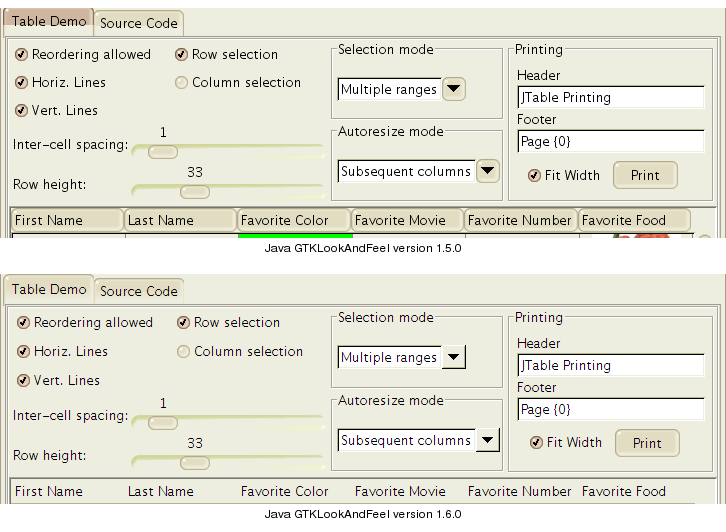
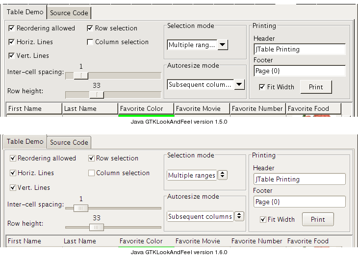
The filechooser and button examples of the Default theme are quite look alike between the Java version, so let's skip to the table demonstration, which does exhibit some rendering differences:
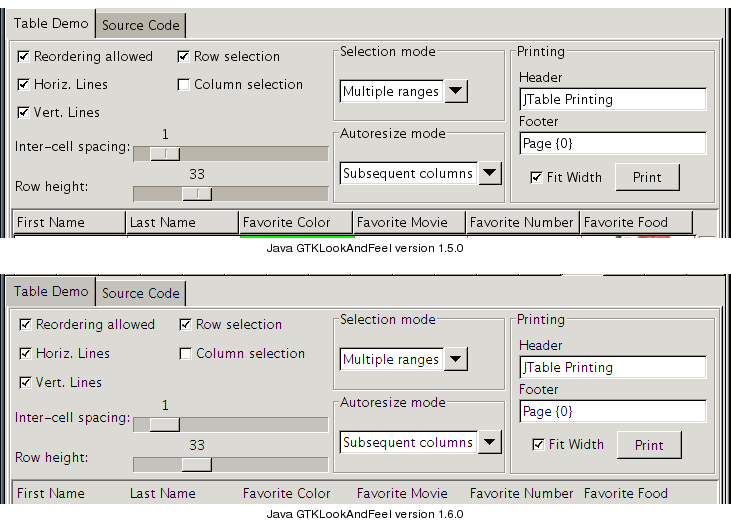
Key differences here are the JSlider and column header components. The slider does not have the center indicator anymore, which reduces the visual clutter but could make it hard to position correctly. The column headers also have their vertical separator bars removed, which makes the dialog easier on the eye, but can make resizing columns a bit harder. You should decide for yourself which rendering is better.
GTK Look and Feel comparison: Grand Canyon theme
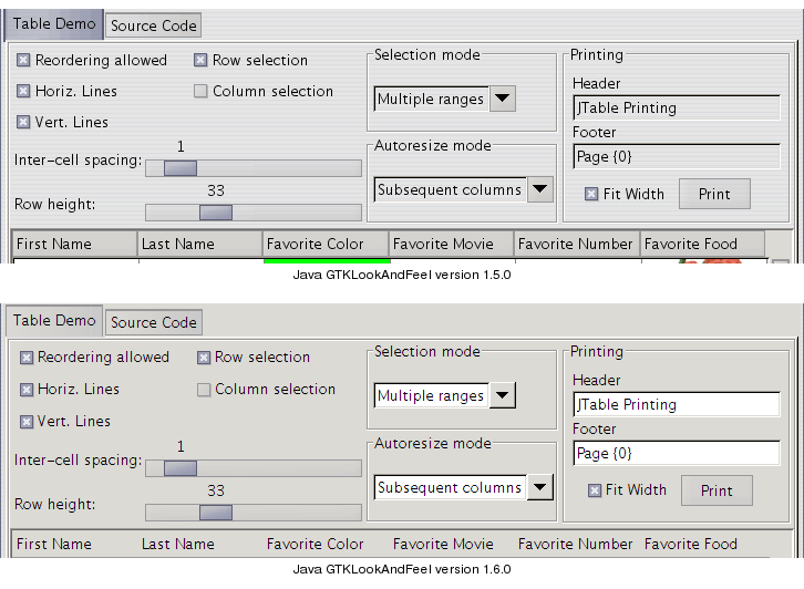
The Grand Canyon theme is up next for review. The two most interesting comparisons here are the internal frames demo and the table demo. I'll quickly describe both of them, starting with the internal frames demo.
The difference in window decorations apparent in the Default GTK theme is gone when using the Grand Canyon theme: both 1.5.0 and 1.6.0 render the native decoration and buttons correctly. The rendering errors you see, the white lines, are only displayed on the 64-bit JVM, whereas the 32-bit one renders everything correctly.
The second difference here is again the way tabs are displayed, but even more clear using this theme. Moving on to the table demonstration, we see this:
The dropdown comboboxes are rendered correctly on the 1.5.0 JVM, while Mustang draws a boxy and flat arrow seemingly coming from the Default theme. This is not an error in the table demonstration, because it is also apparent in the filechooser demo. Again, the older rendering seems to be preferred. The second change, as with the default theme is that the table column header separators seem to be gone. Again, decide for yourself which is better.
GTK Look and Feel comparison: Smokey Blue theme
By now, you're probably already aware I'm keeping the real surprise for the end, so I'm first going to discuss the Smokey Blue GTK theme and after that, I'll fire up Clearlooks so you'll be amazed, or maybe disappointed. For comparing Smokey Blue, I'll first use the filechooser and then the table demonstration.
So, you might play a game of spot the ten differences here. Let's go ahead and sum up the differences. First of all, the pinstripes are gone in 1.6.0, which makes the theme look quite different than intended. Secondly, the dropdown combobox looks like it's rendered using the Default GTK theme. The directory and file list scrollbar arrows are highlighted without even focusing on them. The list headers are gone and the separator bar with the dots is narrower in 1.6.0. That's five differences, all of which decrease the overall look and feel and nativeness of the Swing widgets.
Now, let's see what happens to the table demonstration with these five changes in mind:
Well. The pinstripes are still gone, the comboboxes look boxy, the input fields now also lost their look and traded it in for Default rendering. On top of that, the tabs look worse. It's clear that the current Mustang build isn't really recommended for Smokey Blue users, all three of them ;).
GTK Look and Feel comparison: Clearlooks DeepSky theme
So, finally we're at the Clearlooks DeepSky theme comparison and boy, have I got news for you! Forget all the worries prevalent in the previous theme comparisons, well, except the tab issue. I'll show you the buttons and table comparison, prepare to be shocked.
I like this a lot - near perfect rendering using the Clearlooks theme in Mustang. Java 1.5.0 falls back to the default theme because it doesn't understand the clearlooks theme engine. Combined with the subpixel antialiasing, Java Swing applications now perfectly fit into my Ubuntu GNOME desktop. But it gets even better, check out this table demonstration comparison:
Oddly enough all widgets look great under Clearlooks: the checkboxes, sliders, comboboxes and input fields are identical to their native counterparts. The table column headers don't have separators, just like with other themes, but it's the least of my worries. I find it really weird that Smokey Blue gets mangled underway, while the radically different Clearlooks is presented with high fidelity.
If you want to see all 16 GTK comparison screenshots, go here.
Conclusion
My take
Subpixel font antialiasing offers a great advantage for LCD and TFT owners everywhere, and it will provide a way for Java applications to better visually integrate into the native windowing environment. The technology works in theory, and more importantly it works out well in practice.
There are major differences in the way GTK themes are rendered by Java 1.5.0 and Java 1.6.0. For the Clearlooks theme this works out well, but for the other three tested themes there are some unnecessary regressions in rendering. Especially the tabs issue is an important one, since tabs are used excessively in the SwingSet demo.
I'm sure the rendering issues will be polished before the final release of Mustang, and I'll get back to them later. For now, I think I've already given you an idea of what to expect from Mustang. There were also some quircks I encountered while screenshotting: the JSlider component causes crashes on my 64-bit JVM everytime it needs to be displayed, and inner frame window decorations exhibit artifacts when used on a 64-bit JVM.
I think there are great times ahead for Java GUI programmers, since the near perfect integration of GTK rendering makes Java applications look and act nearly indistinguishable from native applications. There are also enhancements going on for the WindowsLookAndFeel, but that'll be a separate article if I get to it.
About this article
This article was added on the 8th of October 2005.
Related pages
There's more information and a lot of screenshots of Java 2 SE 6.0 Mustang available on these pages: